Understanding Your Visibility Dashboard
The visibility dashboard is where you'll spend most of your time in Appearly. It gives you a complete picture of how your brand performs across AI engines, from the headline GEO score down to individual engine breakdowns and trend charts. This guide explains each section so you know exactly what you're looking at.
In this article:
- Open the Visibility Dashboard
- Read the GEO Score Card
- Track Your Score Over Time
- Compare Performance by Engine
- Use the Radar Chart
- Explore the Detail Tabs
Open the Visibility Dashboard
Head to your workspace and select Visibility in the sidebar. This is the main view of your brand's AI performance.

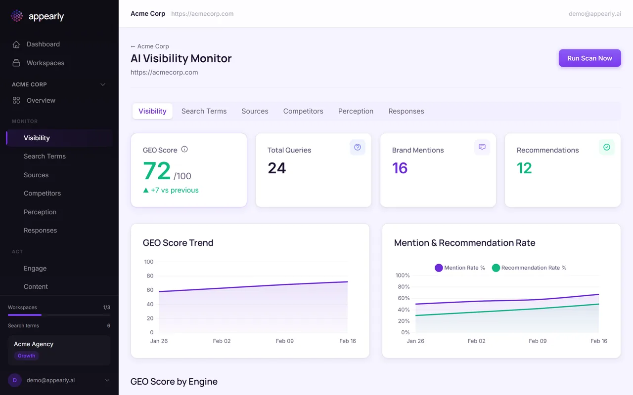
Read the GEO Score Card
The large number at the top is your GEO score. The color tells you where you stand at a glance:
- Green (60+): Strong visibility. AI engines mention and recommend you regularly.
- Amber (30-59): Moderate. You're showing up, but there's room to grow.
- Red (under 30): Low visibility. Needs attention.
The arrow next to the score shows whether you're trending up or down compared to the previous scan.
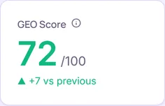
Track Your Score Over Time
Below the score card, the GEO Score Trend chart plots your score over time. This is where you see if your optimization efforts are paying off.
A rising line means things are working. A flat or declining line means it's time to revisit your action plan or adjust your keyword strategy.
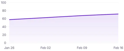
Compare Performance by Engine
The GEO Score by Engine section breaks down your score for each AI engine individually. This is one of the most actionable views in Appearly.
You might discover that ChatGPT mentions you frequently but Perplexity rarely does. That kind of gap tells you exactly where to focus: create content that Perplexity's web search is more likely to surface.
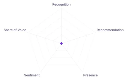
Use the Radar Chart
The radar chart gives you a visual snapshot of all 5 GEO dimensions at once: Recognition, Recommendation, Presence, Sentiment, and Share of Voice.
An uneven shape reveals where your brand is strong and where it's weak. If the Recommendation axis is noticeably smaller than the rest, that's your biggest opportunity for improvement.
Explore the Detail Tabs
Below the dashboard, you'll find tabs that go deeper into specific aspects of your visibility:
- Search Terms: See how each keyword performs individually.
- Sources: Find out which of your pages AI engines cite.
- Competitors: Compare your mentions against competitors.
- Perception: Read an AI-generated summary of how engines describe your brand.
Each tab has its own dedicated guide. Start with whichever area matters most to your strategy.